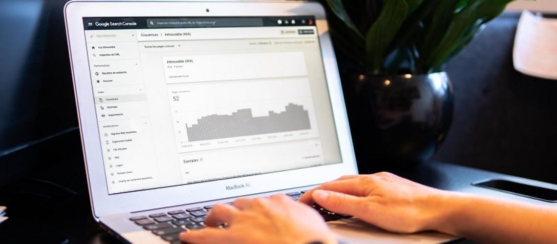
Some people think that web design is all about making your website attractive. Although that’s partly true, a good web designer will also take SEO into account.
In other words, if your website looks great, yet you can’t find a reason why it doesn’t generate the amount of traffic you’ve anticipated, it might be down to some of these web design mistakes.
1. Non-Responsive Design
Even though you’ve managed to create a great-looking and intuitive website on desktops, make sure it’s responsive. Otherwise, it wouldn’t look anywhere near as good on mobile devices.
With a non-responsive design, the user experience on mobile phones will be significantly worse.
With that said, if your website’s design is on-point on desktop, yet you’re not generating the traffic you’re expecting, then it might be due to the fact that it’s not mobile-friendly.
Because mobile devices account for over 50% of all web traffic, Google has switched to mobile-first indexing, meaning that websites with mobile versions will outrank those without.
Even more, in June 2021, Google will roll out a new Core Web Vitals update. This means that a website’s user experience will now have a greater effect on its rankings in the search engine.
In other words, mobile-friendliness is something to be taken seriously. This is why you should work with the best mobile app companies when developing your website and why not your app.
2. Poor Navigation
Clunky navigation will negatively impact your website’s SEO in multiple ways. Firstly, users will most likely get confused and end up leaving your site, bringing you high bounce rates and less dwell time, which are important ranking factors.
Secondly, search engine crawlers will also have trouble when navigating your website.
Consequently, they might not be able to index some of your web pages, which is one of Google’s ways of figuring out whether your website is optimized for user experience or not.
With that said, always consider mobile-friendliness. Start by making sure that your navigation buttons are optimized for mobile.
What may be easy to click on desktop might be difficult to tap on mobile devices.
Our fingers are not as precise as a mouse. So, if your buttons are small and close to each other, we might accidentally press the wrong button, which ruins the whole experience.
Secondly, if you’re using a search bar, make sure that you place it at the top of your web page rather than hiding it somewhere in the menu.
And finally, use traditional header and footer placements.
Like with the search bar, users will intuitively look for important information on the top of the page. So, by placing them somewhere else, you’ll most likely get them confused.
3. Overlooking 404 Pages
Although finding broken links can sometimes be difficult, that doesn’t mean you should use generic 404 Pages until you resolve the issue. By including a link to your website, you’ve still got a chance to get users and crawlers back.
Furthermore, spend some time designing your error pages.
If you make them aesthetically pleasing, rather than using the boring error page that everyone has seen, you’ll have better chances at convincing users to go back to your website.
4. Infinite Scroll
If you have a blog with many posts, or you’re running an online store, integrating the infinite scroll feature might seem like a good idea at first, especially on mobile devices.
After all, turning five pages of content into a single, never-ending page might get users to spend a little more time on your website than usual.
However, it’s not such a good idea in terms of SEO. Here’s the thing: with infinite scroll, your website’s content loads as the user goes further down the page.
But search engine crawlers, on the other hand, won’t be able to tell that your website is using infinite scroll.
Because of that, crawlers may treat your entire website as just a standard page. That’s because of the crawl budget or the amount of time crawlers will allocate for checking out your website.
The more pages your website has, the higher the crawl budget will be. So, even though there is lots of content on your infinite page, crawlers will only go through the content that’s displayed once the website loads, leaving the rest unindexed.
5. Large Image Files
While images are important for your website’s overall design, having too many large image files will severely impact your site’s loading speed.
A slow loading speed results in a high bounce rate, drop in rankings, and you may also miss out on potential sales.
We’ve talked to a professional website design company, and they said that ideally, your website should take no longer than three seconds to load. Anything that goes beyond that will get you a significant increase in bounce rates.
When optimizing your website’s loading speed, you don’t have to get rid of every image you’ve got. You just need to compress them before uploading.
By compressing your images, you’ll be able to save around 250 KB. And given that the average web page is around 2.07 MB compressing images can make a noticeable difference.
6. Text in Images
Many website owners make the mistake of integrating text content within an image.
For starters, search engine robots aren’t always able to recognize text in images. Consequently, they will assume that your web page doesn’t contain any text.
So, if you’re writing an introductory paragraph for a blog post you’ve created, chances are that you’ll use keywords so your blog post may appear higher in the rankings.
If you were to use text in an image, crawlers would miss out on those keywords entirely.
When going responsive, as screen sizes get smaller, so does the image containing the text, making it harder to read.
To fix this issue, start by adding a text layer over the image. Make sure to provide alt text for the images, so you could let search engine bots understand the content of the said images.


